Photojournalism and Bias

Photo By: Ed Clark
Image Source: http://www.thegreatleapsideways.com/?p=209
This is a beautiful image taken in a moment of history during the time that the president Franklin Roosevelt has passed away. It shows a black man who is crying uncontrollable and playing his instrument at the same time. Most probably would say he is crying because the president has passed however we may never know exactly why he is because we were not there. In the background we see others who seem to sad, distraught and clearly no one is happy, but they are not crying hysterically like the black man. Just by looking at the picture many questions would arise why is he crying so much and everybody clearly is sad but not as sad as the guy. Also, even though he is really sad he is still playing his instrument and it makes you wonder why is he standing crying with an instrument in his had.
Principle 1: Subject’s Expression - The subject clearly does not looked relaxed, he seems very sad based on his facial expression and the tears on his face. You can definitely tell that something is hurting him however we can tell what is is but it seems to be affecting him in a big way. He is definitely not looking at the camera or trying to pose for the camera, he may not even know his picture has been taken. He is not posing for the picture because he is crying but what is odd he is still playing an instrument. It seems more of a bitter sweet moment because as much as he probably would like to cry he has to still play an instrument.
Principle 2: What
feelings does the image create? - This image creates feelings of sadness, hurt, sympathy because just looking at the subject you don't know why he is crying but you just feel sympathetic. It makes you want to just give him a hug and let him know all will be well because most people don't like to see others crying especially if it is not tears of joy.
Principle 3: Is
the image black & white or color?- Yes this image is black and white, during this era black and white photos were popular at this time. Even though the picture is in black and white it speaks volume.
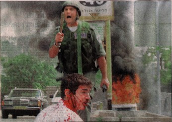
Photo By: Unknown Source
Image Source: http://www.wildolive.co.uk/mediabias.htm
This image shows a male who is severely wounded and a police offer with a knife in his hand and based on the image it seems as though the police officer did this to the male. This image speaks untruth after I read the actually story about this image. Many must remember a picture can create a lot of damage and portray something that is untrue. This image was sent to the press stating that an Israeli policeman severely wounded a Palestinian boy and made the press believe they Israeli policeman were attacking Palestinians. After being contacted by the victim he was actually Jewish from Chicago and he was studying abroad. He was actually attacked and beaten by Palestinians however it was the Israeli policeman that save him. He was yelling at the Palestinians to back off however by the images that were taken it made it same as though the Israeli attacked him and he was Palestinian. This is to show how the press can create friction and tension by an image which is untrue. Just looking at a picture many can form their own opinions on what is going on in the image without actually having facts.
Principle 1: Obvious main subject,
about ¼ to 2/3 of image area. The main subjects in the picture are pretty big and we know exactly who were are looking at. It is more concentrated on the male sitting down because he is wounded and the main topic but the male standing up is also important. The main subject does not crowd the edges at it is still a decent size. It all depends on which certain subjects were taken out.. however if everything besides the two males are still there the image would still have the same impact.
Principle 2: Texture. The image seems smooth, a bit blurry but still clear enough to see exactly what is going. Based on the image it probably creates feelings of anger, hurt, also worry because you will start to wonder what is going? why is he bleeding? why is he on the ground? Then you basically become inquisitive because you want to know everything in detail.
Principle 3: Quality of Light The light seems to be flat, bland and uninteresting. Based on the image you can clearly see smoke which maybe the cause of the dull look and the time of the day that it was. Also, based on the photographer's camera can be another reason the image came out the way it did. In the article it was said it was freelancers taking images so the person could have been an amateur or the way the camera was angled.

Image Source: http://flyawaybride.com/category/special_offers/
This image of these two individuals speak truth and it shows the strong affection between these two individuals. It shows general love and affection they have for one another and you can see it coming through on there faces. This is a lovely couple who took pictures after they were engaged and it looks wonderful. Based on there faces you see love and warmth that is felt through the image. It shows general expression of what they feel inside and it shows in the image.
Principle 1: What in the image helped to create that feeling? This is a quiet image that has a lasting impact and it makes you feel the love that is portraying through the image. It gives you that joy to see two people in love with one another and the joy they bring to each other. Just the smiles on there face and looking at one another says it all.
Principle 2: Use of lines The lines in this image are curvy, slanted, diagonals, converging all over the image but it a light way and it has this romantic affect. The lines take you towards the subject because right in the middle between the two main subjects look like a bright space without lines. The lines in the image draw you into the image and creates a beautiful effect.
Principle 3: KEEP IT SIMPLE The composition is simple and it is not clustered in any format. It has two main subjects and a clean clear background and even the basic lines does not make it look clustered. The 2 images and the clarity of the photo is what makes the photo simple and the black and white as well.
No comments:
Post a Comment