THE ART OF PHOTOJOURNALISM

Photo By: Eadweard Muybridge
Image Source: http://americanhistory.si.edu/muybridge/
Year Created: 1887
Principle 1: Is this image black and white or color
How was this principle used?: This image of is black and white as you can see and this is because during this time color photo was not invented as of yet.
Principle 2: What feelings does the image create?
How was this principle used?: This image captured my attention because it is interesting to see how photographers took photos many years ago. Also, there is numerous pictures of the gentleman in the photo doing different things and different poses. It basically looks like a play by play of each move he made and what he was about to do next which is very interesting.
Principle 3: Contrast appropriate
How was this principle used?: In each photo some areas are lighter than others and then other parts are dark and it is due to the way they took photos during this time and what they used to take photos. In each photo part of the background is dark and a few you may say one side is extremely bright. You cannot see this person's face to clearly but by the body language looks like they are happy and on there way somewhere.
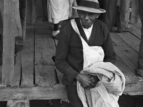
Image source: http://www.spartacus.schoolnet.co.uk/ARTshahn.htm
Year Created: 1935
Principle 1: Is this image black and white or color?
How was this principle used?: This image is clearly black and white and this was because it was photographer's choice at this point in time to use black and white photos. Also during this time color photos were pretty expensive and everyone was using black and white photos.
Principle 2: Background compliments or detracts from composition
How was this principle used?: The background compliments the photo because it gives you a sense of where he is and what he is doing. Clearly we can see feet behind him so we know other people were there and he is sitting down on maybe a porch or some sort.
Principle 3: What in the image helped to create that feeling?
How was this principle used?: The image grows on me because I am looking at an individual and I do not know what he is thinking and what he is doing. The more you look at the photo you think that he is looking at you and I am not to sure if it is a smirk on his face or not but it makes you keep looking.

Image Source: http://r1ma.blogspot.com/2012/08/editorial-vogue-120-stylish-singers.html
Year: 2012
Principle 1: Quality of Light
How was this principle used?: The light at the right is pretty bright reflecting on the dark colored dresses an bringing them to light in a sense. The dress closer to the window had this dark but purple highlight at the bottom of the dress and it looks stunning. But further to the left its a bit darker and then you have a bold red dress standing out and it is amazing.
Principle 2: Keep it Simple
How was this principle used?: The background is white and simple no form of clutter at all. It is simple because there are already four big flawless dresses and each of them on there own has a bold color. It would not make sense to clutter the background with the bold dresses already it would make it look like confusion and too much going on.
Principle 3: Obvious main subject, about 1/4 to 2/3 of image area:
How was this principle used?: They are four bold images in this photo and all four are taking up the whole space. If each of them were to be separated it would still look beautiful taking up its own space. Each model have on a bold dark dress and as a whole it looks absolute stunning the concept of the picture is to attract the viewers to each dress.
No comments:
Post a Comment